Generally the way you add the Statamic elements or content in the code is somewhat similar as you would do in Blade. So very simply put, you just add whatever you wish to include that’s from Statamic between 2 curly braces like so “{{ element }}”.
An example is shown for each “Category” below.
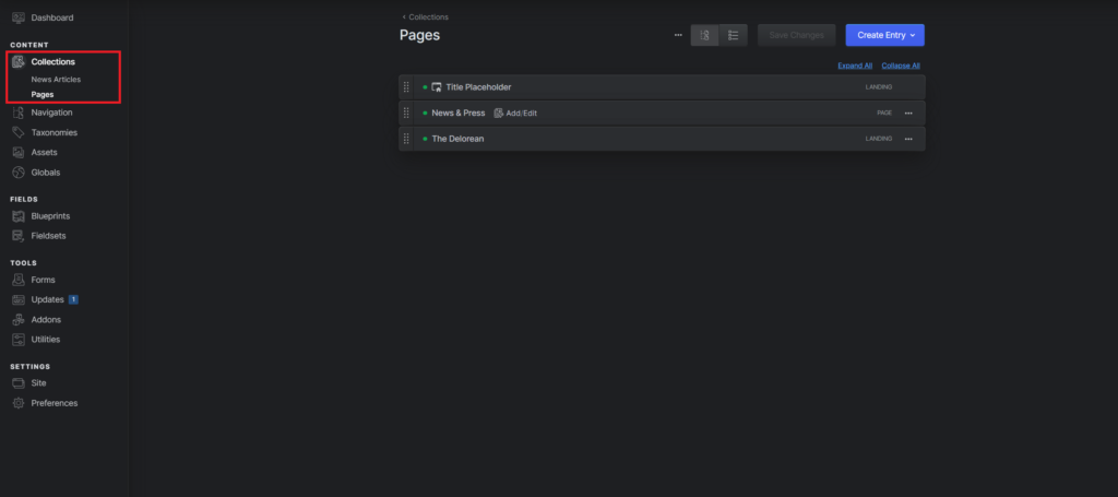
Collections
Collections are groups of content entries similar to “post types” in other CMS platforms.
They are typically used for:
- Blog posts
- News articles
- Projects
- Events
- Case studies
Each collection:
- Has its own URL structure
- Can be dated (like blog posts)
- Uses a blueprint to define its fields
- Stores entries in flat files (Markdown + YAML) by default
Think of a collection as a structured container for repeatable content.
Here’s how i did it with my homepage. So as mentioned you take the double curly braces “{{ }}” and then add whatever you wish which is in this case “template_content” and the partials, which are the navigation (at the top of the page) and the footer (at the bottom).
<body class="bg-gray-100 font-sans leading-normal text-gray-500 relative min-h-screen overscroll-none" id="top">
    <header class="max-w-7xl mx-auto">
        {{ partial:nav }}
    </header>
    {{ template_content }}
    {{ yield:content }}
    {{ partial:footer }}
    <div class="absolute z-40 w-full inset-0 opacity-75 pointer-events-none" style="background: url('/img/film-overlay.png') top     center; background-size: 1400px"></div>
    <script src="{{ mix src="/js/site.js" }}"></script>
</body>
</html>Navigation
Navigation allows you to manage menus and link structures across your site. You can create multiple menus (like main navigation or footer navigation), reorder items with drag-and-drop, and nest links for dropdown menus. It separates content management from how links are displayed.
You can:
- Build structured menus (main nav, footer nav, etc.)
- Drag and drop pages into order
- Add external links
- Nest items for dropdowns
Navigation is separate from collections — it’s purely for organizing how links appear in your frontend.
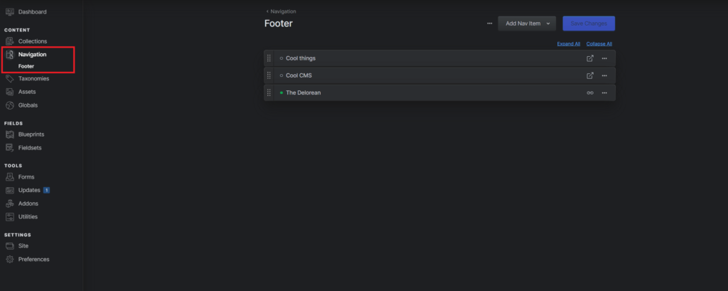
I used the “Navigation” part / feature in my footer here’s how. So as mentioned you take the double curly braces “{{ }}” and then add whatever you wish which is in this case “nav:footer”. The nav means that its a “Navigation” part / feature and the footer part is the name of the wanted navigation.
<div class="lg:pl-12">
                <nav class="text-lg antialiased -ml-1">
                    <ul>
                        {{ nav:footer }}
                        <li><a class="p-1 inline-block transition hover:text-white" {{ if external }} target="_blank" rel="noopener"     {{ /if }} href="{{ url }}">{{ title }}</a></li>
                        {{ /nav:footer }}
                    </ul>
                </nav>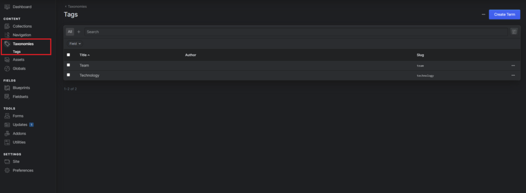
</div>Taxonomies
Taxonomies are systems for organizing and classifying content. They allow you to group entries using shared terms like categories, tags, or topics. This makes it easy to filter content and generate archive-style pages dynamically.
Common examples:
- Categories
- Tags
- Topics
- Authors
They allow you to:
- Group entries across collections
- Filter content dynamically
- Create archive pages (e.g., all posts in “Design”)
Taxonomies consist of terms, and entries can be assigned one or more terms.
Here’s a news article where you can add the Taxonomies (Tags):
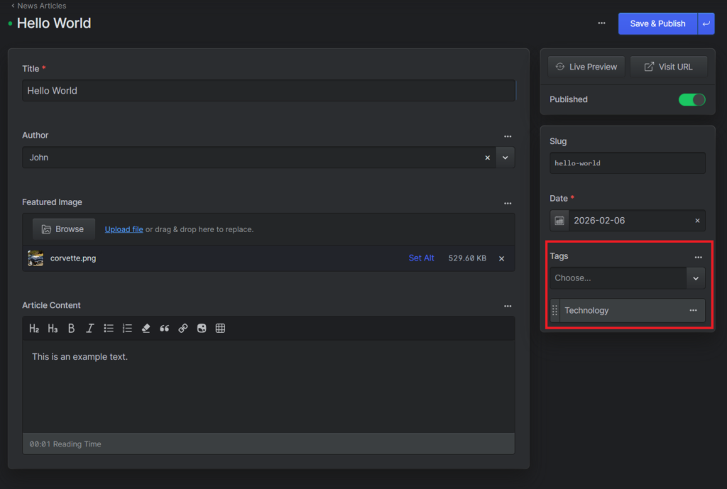
I didn’t use Taxonomies to extensively but i did use them for some extra visuals for the news page for the entries there. So as mentioned you take the double curly braces “{{ }}” and then add whatever you wish which is in this case “tags”. The tag is the name of the Taxonomy used in my case and the “limit=1” is just here so only one is shown even if more are assigned but in my instance that isn’t the case.
<div class="flex items-end justify-between">
            <div>
                <p>{{ date }}</p>
                <p class="text-sm">By <a href="" class="text-gray-700 hover:text-white">{{ author:name }}</a></p>
            </div>
            {{ if ! hide_tag }}
            {{ tags limit="1" }}
            <a href="{{ url }}" class="px-3 py-1 text-gray-100 font-bold bg-yellow transition hover:bg-orange rounded-full text-sm">{{ title }}</a>
            {{ /tags }}
            {{ /if }}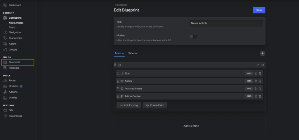
</div>Blueprints
Blueprints define the structure and fields available for content editing. They control what input fields appear in the control panel and determine how content is structured and validated. Blueprints make Statamic flexible and allow developers to tailor the editing experience precisely to project needs.
They:
- Control what fields appear in the CMS (title, image, text, etc.)
- Define validation rules
- Can be reused across collections and taxonomies
- Are stored as YAML files
If collections are containers for content, blueprints are the “form builder” that defines what content fields exist inside them.
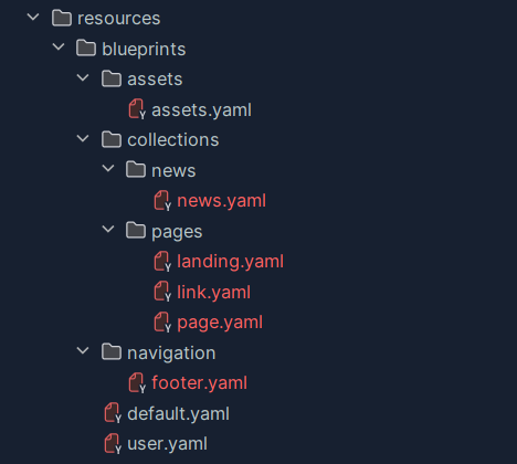
Folder Structure inside the Project:
Assets
Assets in Statamic are the files used throughout your website, such as images, PDFs, videos, and downloadable documents. They are managed inside asset containers, which map to specific folders in your project and can be stored locally or in cloud storage like S3.
From the control panel, you can upload, browse, organize, and edit metadata (alt text, titles, etc.) for each file. Assets can then be selected inside entries via blueprint fields, making them reusable and centrally managed across your site.
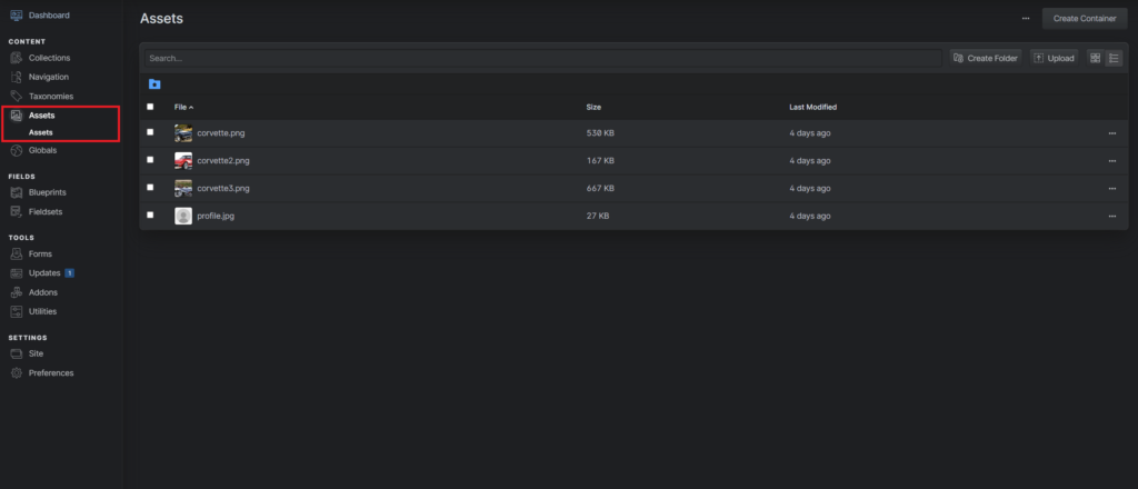
I only used the assets for images, no PDFs or videos or so. As mentioned you take the double curly braces “{{ }}” inside the “src=” and add what you wish to display. Glide is a package which is used to optimize images to make the file size smaller and gives you options to modify the image. You could make the image black & white or tilt it or focus it to a specific point which you can then define in Statamic.
<a href="{{ url }}" class="relative overflow-hidden rounded-t-xl">
        <img class="object-cover transition duration-[400ms] ease-in-out scale-110 group-hover:scale-100 w-full h-60" src="{{ glide :src="featured_image" width="600" height="400" fit="crop_focal" }}" alt="">
        <div class="absolute opacity-0 transition duration-[400ms] ease-in-out group-hover:opacity-75 z-20 inset-0 mix-blend-overlay object-cover w-full h-60 bg-gradient-to-br from-orange-dark to-aqua"></div>
    </a>