Index
Here is an Index of my Statamic project, it doesn’t always look like this since things might change with updates or because of a different folder structuring by the person themselves. So as mentioned while somethings might align with different projects / versions this is only guaranteed to match my project. (These paths are all from the project root).
| Blueprints | resources/blueprints |
| Users | users (each user saved as yaml-file) |
| Views | resources/views |
| Images | public/assets & public/img (this isn’t visible in Statamic) |
| Statamic elements (collections, navigations, etc. asides from blueprints) | content/(assets, collections, globals. navigations, taxonomies, trees) |
| Enable Statamic pro for development | config/statamic/editions.php |
| base layout, how the homepage will be built & displayed | resources/views/layout.antlers.html |
| general content of the homepage | resources/views/home.antlers.html |
| default page it reverts to when no content is given | resources/views/empty.antlers.html |
| News page & content | resources/views/news |
Glide
Something you will see in the code with images is “glide”. Glide is a package used for optimizing and modifying images. You can resize them or add effects like making an image gray, tilting it or so, you can also make it resize on a specified point called the focal-point. So that when the image is resized that the focal point will always be visible. You can choose the focal point in Statamic once you add the image. Here’s the package: Glide Package
Project
To learn Statamic i firstly watched the Laracasts Series, Learn Statamic with Jack. After which i recreated the website he used in the series myself. I used Visual Studio Code to built it using HTML & CSS. Now out of habit i used plain CSS instead of Tailwind CSS. This causes me a bit more work since now i have to covert my “plain CSS” to Tailwind.
Now the next step is to move it all over to the Statamic project which i have in PHPStorm.
The first thing that I did is take a quite look around Statamic which is when I saw that there’s an Update available. After which I updated Statamic from v5.73.5 to version 6.2.3. After the update the Site didn’t work anymore or at least to a high degree which is when it was decided that I would revert the update back to v5.73.5 where everything was still working as intended.
Homepage
Generally the way I went with working and what I would say is the easiest way to go about working with sometime like this, is to split things up into smaller chunks. Meaning that you don’t do the whole homepage at once but in parts. So I split the homepage into 4 chunks, the top navigation (main nav), the title (introduction text), the panels and the footer.
The first action I took is to separate the main nav and the footer from the homepage and put them in the partials folder and then included them back in the “layout.antlers.html” file with antlers “{{ partial:nav }} & {{ partial:footer }}”.
<body class="bg-gray-100 font-sans leading-normal text-gray-500 relative min-h-screen overscroll-none" id="top">
    <header class="max-w-7xl mx-auto">
        {{ partial:nav }}
    </header>
    {{ template_content }}
    {{ yield:content }}
    {{ partial:footer }}
    <div class="absolute z-40 w-full inset-0 opacity-75 pointer-events-none" style="background: url('/img/film-overlay.png') top center; background-size: 1400px"></div>
    <script src="{{ mix src="/js/site.js" }}"></script>
</body>Title
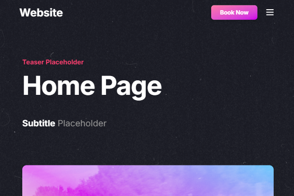
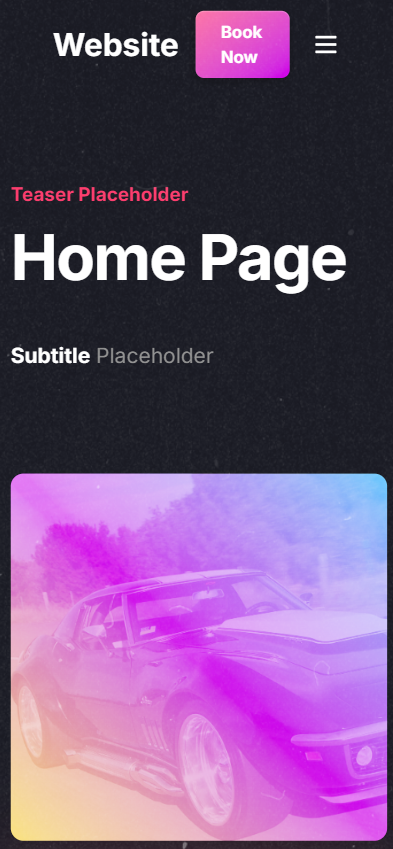
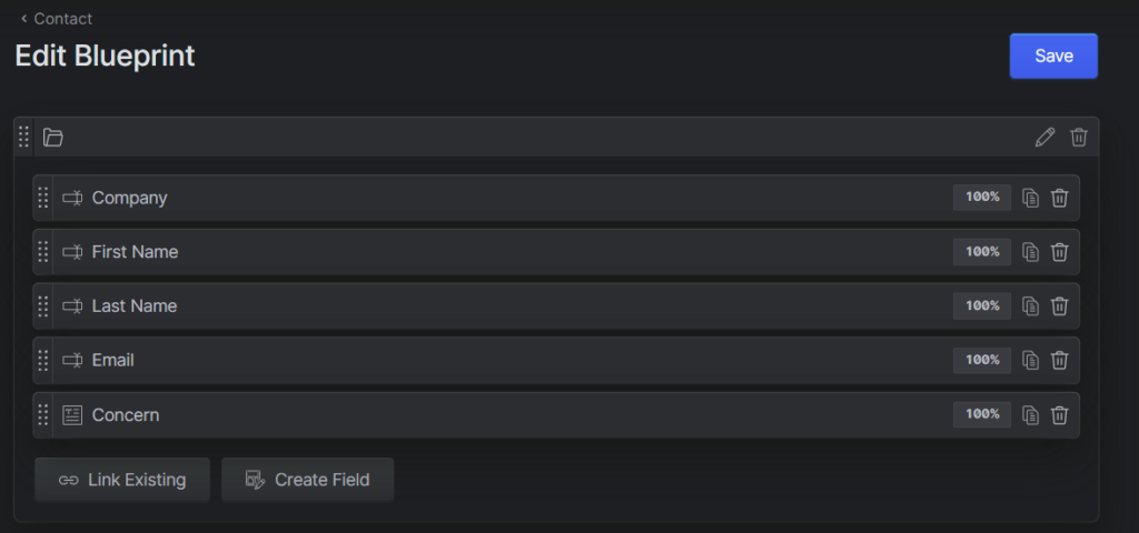
After that was done I move over to Statamic to create the needed Pages and Blueprints for the given code. The first action was to create the Blueprint for the Lading pages (homepages) which for now only included the title. The title was split into 4 different part in the blueprint, the teaser (small red text at the top) as a normal text field, the title also as a normal text field, a toggle whether you wish to show the lightning bolts and the subtitle as a markdown (since part of the text is bold). These were then added in the code in each respective place inside the “home.antlers.html” file.
Each of the text added between the curly braces is what we named the different fields in Statamic. This means that the title doesn’t have to be named that, theoretically you could name it cheese and then add it in the code like so “title text -> {{ cheese }}” but it is discouraged since it wouldn’t make sense and is therefor not understandable.
- teaser text -> {{ teaser }}
- title text -> {{ title }}
- lightning bolt -> {{ if show_lightning_bolts }}, {{ /if }}
- subtitle text -> {{ subtitle }}
<section class="max-w-5xl mx-auto px-4 lg:px-6 py-40 relative hero">
    <h6 class="text-red font-bold text-lg antialiased mb-4">{{ teaser }}</h6>
    <h1 class="text-6xl md:text-7xl lg:text-8xl tracking-tight text-white font-bold">{{ title }}</h1>
    {{ if show_lightning_bolts }}
    <img src="/img/lightning-bolts.png" class="absolute h-64 top-8 right-0" alt="Lightning Bolts">
    {{ /if }}
    <div class="max-w-4xl mt-12 hero-subtitle">
        {{ subtitle }}
    </div>
</section>Panel
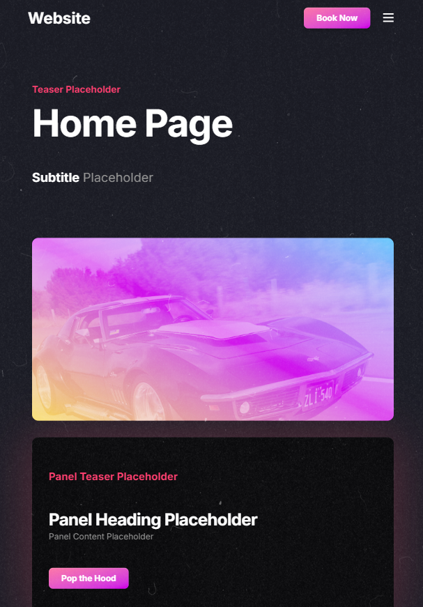
The next part of the homepage was the panels, boxes or whatever you wish to call them where one half was an image and the other some text with a button. So naturally that is what i set my sights on next. For that i headed back to the blueprint we created before and added a new field, this time a “replicator field” called “Panels”. In there i added a set like so:
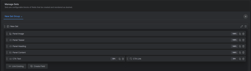
After which i went back to the code and created a new file in the partials for panels called “panels.antlers.html” and removed the code from the “home.antlers.html” file for the panels and moved them into the panels file. Now i needed to enclose all the code between these two “{{ panels }} & {{ /panels }}” antlers tags, what this does it creates a loop so it loops over the code for each panel created in Statamic so they look the same.
Then i added the different antler tags for the panel itself so the image as an image, teaser as a text, heading as a text, content as a markdown (since its partially bold) and the Button (Call to Action or CTA for short text as a text & link as a link with 50% width each so they fit besides one another).
- background image url -> {{ panel_image }}
- teaser text -> {{ panel_teaser }}
- heading text -> {{ panel_heading }}
- content text -> {{ panel_content }}
- a tag, href link -> {{ cta_link }}
- link text -> {{ cta_text }}
{{ panels }}
<section class="max-w-6xl mx-auto p-4 lg:px-6 grid grid-cols-2 gap-8 pb-12 {{ ! first ?= 'mt-32' }}">
<div class="relative {{ index % 2 ?= 'order-last' }}">
<div class="h-[500px] relative z-10 bg-gradient-to-tr from-orange to-blue via-purple rounded-xl bg-cover">
<div class="absolute h-full w-full mix-blend-screen opacity-50 rounded-xl bg-cover" style="background-image: url('{{ panel_image }}')"></div>
</div>
</div>
<div class="relative">
<div class="rounded-xl h-[500px] block bg-black/[.8] shadow-glow-red p-8 flex items-center">
<div class="hero">
<h6 class="text-red font-bold text-xl antialiased mb-12">{{ panel_teaser }}</h6>
<h2 class="text-[32px] tracking-tight leading-tight text-white font-bold">{{ panel_heading }}</h2>
{{ panel_content }}
<a href="{{ cta_link }}" class="mt-12 bg-gradient-to-br from-pink to-purple rounded-lg text-white inline-block py-2 px-6 font-bold shadow-highlight transition hover:scale-[1.05]">
{{ cta_text }}
</a>
</div>
</div>
</div>
</section>
{{ /panels }}Now that the panel itself was done i had to add it to the “home.antlers.html” file so it would actually be displayed this is done with “{{ partial:panels }}”.
<section class="max-w-5xl mx-auto px-4 lg:px-6 py-40 relative hero">
    <h6 class="text-red font-bold text-lg antialiased mb-4">{{ teaser }}</h6>
    <h1 class="text-6xl md:text-7xl lg:text-8xl tracking-tight text-white font-bold">{{ title }}</h1>
    {{ if show_lightning_bolts }}
    <img src="/img/lightning-bolts.png" class="absolute h-64 top-8 right-0" alt="Lightning Bolts">
    {{ /if }}
    <div class="max-w-4xl mt-12 hero-subtitle">
        {{ subtitle }}
    </div>
</section>
{{ partial:panels }}Top / Main Navigation
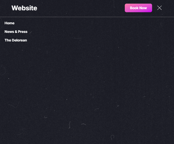
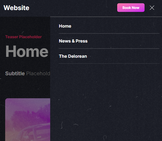
Now since the main content of the homepage is done we can turn our focus to the part that every website needs the navigation. With Statamic there are actually two ways you can create a navigation. We will look at the one where you use the pages to create a navigation. As for the other method, that will be used for the footer navigation.
So firstly what needed to be done is add some more pages in our collection. As a baseline for a horizontal navigation at least is to have at least 2 links excluding the home link. This is so that it doesn’t look so empty or it can also look weird at times.
The pages i created are “News & Press” (since I will need that later) and “The Delorean” just as a placeholder.
After that was done it was time to move back to the code base to now create the navigation for or well with the newly created pages. There inside the partials folder in the “nav.antlers.html” file i added the antlers tags “{{ nav:collection:pages }} and {{ /nav:collection:pages }}” so it takes the pages from the collection in their hierarchical order. Now what i added as future proofing is what to do if a page has child pages that i did with an if check “{{ if ! children }}”, “{{ else }}” and “{{ /if }}”. Inside there was a loop that just loops over the children and creates a link for each (same as what “nav:collection:pages” besides that it’s only for the children pages of course.).
<nav x-data="{mobileNavOpen: false}">
<div class="p-4 lg:px-6 flex items-center justify-between">
<div class="flex items-center">
<a href="/" class="font-bold text-3xl text-white p-2 antialiased">Website</a>
<ul class="hidden lg:flex items-center space-x-4 ml-6">
{{ nav:collection:pages }}
{{ if ! children }}
<li><a href="{{ url }}" class="p-2 relative hover:text-white transition">{{ title }}</a></li>
{{ else }}
<li class="group">
<button class="p-2 relative flex items-center transition group-hover:text-white">
<span>{{ title }}</span>
{{ svg src="icons/arrow-down" class="ml-2" }}
</button>
<div class="absolute rounded-lg py-4 -mt-2 px-2 bg-gray-200 hidden group-hover:block">
<ul class="flex-col">
{{ children }}
<li><a href="{{ url }}" class="py-2 px-4 block transition hover:bg-gray-300 rounded hover:text-white">{{ title }}</a></li>
{{ /children }}
</ul>
</div>
</li>
{{ /if }}
{{ /nav:collection:pages }}
</ul>
</div>
<div class="flex items-center space-x-4 px-2">
<a href="#" class="hidden md:flex bg-gradient-to-br from-pink to-purple rounded-lg text-white inline-block py-2 px-6 font-bold shadow-highlight transition hover:scale-[1.05]">
Book Now
</a>
<button type="button" class="lg:hidden p-2 text-white" @click="mobileNavOpen = ! mobileNavOpen">
<svg x-show="! mobileNavOpen" xmlns="http://www.w3.org/2000/svg" height="21" width="21" viewBox="0 0 21 21"><g fill="currentColor" transform="scale(.875)"><rect x=".5" y="2.5" width="23" height="3" rx="1"/><rect x=".5" y="10.5" width="23" height="3" rx="1"/><rect x=".5" y="18.5" width="23" height="3" rx="1"/></g></svg>
<svg x-show="mobileNavOpen" x-cloak="true" xmlns="http://www.w3.org/2000/svg" height="21" width="21" viewBox="0 0 21 21"><g transform="scale(.875)"><path fill="none" stroke="currentColor" stroke-linecap="round" stroke-linejoin="round" stroke-width="1.5" d="M.75 23.249l22.5-22.5M23.25 23.249L.75.749"/></g></svg>
</button>
</div>
</div>
<div class="p-2 border-t w-full bg-gray-100 min-h-screen absolute z-30" x-show="mobileNavOpen" x-cloak x-trap.noscroll="mobileNavOpen">
<ul class="flex flex-col text-white">
<li><a href="/" class="py-2 px-4 block font-bold">Home</a></li>
<li><a href="#" class="py-2 px-4 block font-bold">The Delorean</a></li>
<li><a href="#" class="py-2 px-4 block font-bold">News & Press</a></li>
</ul>
</div>
</nav>Now what I did with the navigation I didn’t repeat in the mobile nav. That will be adjusted in a bit where i will optimize this also for the mobile view.
Footer
The homepage is now almost finished with the only remaining part being the footer. The footer remains mostly unchanged besides for only part which is the footer nav. Now compared to the main nav that we created directly with the pages this footer nav will be done with the Navigation feature from Statamic. For that we go into Statamic to the “Navigation” tab and create a new one called “footer”, there we can now add nav items those can either be a link to an entry (a existing page) or a specified link (will probably be an external link most of the time since otherwise you can just link to an entry).
Now it would be a lot easier if we had a toggle option if we want the link to open in a new tab / window. So let’s create that. For that we create a new blueprint for the footer navigation and add a toggle field called “Open in a new window”. After we created and saved everything when we go back to the footer navigation when we add a new Item we can see the toggle option. Now let’s bind everything together in our code.
After we created the desired nav items we go to the “footer.antlers.html” file inside the partials folder and add our loop for each nav item which, in this case is “{{ nav:footer }}” and “/nav:footer”.
- a tag, href link -> {{ url }}
- link text -> {{ title }}
Now aside from these two there is something else to do so the toggle option we created actually functions. For that we add an if “{{ if external }}” (external is the handle we gave the toggle field in Statamic) inside the class and then our desired styles (target=”_blank” and rel=”noopener”) and then close the if “{{ /if }}”. So now when the toggle is on then it will apply the given styles inside the if statement.
<div class="lg:pl-12">
<nav class="text-lg antialiased -ml-1">
<ul>
{{ nav:footer }}
<li><a class="p-1 inline-block transition hover:text-white" {{ if external }} target="_blank" rel="noopener" {{ /if }} href="{{ url }}">{{ title }}</a></li>
{{ /nav:footer }}
</ul>
</nav>
</div>As you may see that this is not the whole footer but this is what was changed and made dynamic with Statamic. I decided not to display the rest of the code here since its still the same and would only clutter the space.
News Page
Now that the main page is finished I can get behind the second page that being the news page. Since I already created the page for this I can move on to the next part. The first step is to create a new folder in our views called “news” for everything required by the news page. Then a file for the base news page “index.antlers” then viewing a single news article “show.antlers.html” and finally the card / box which is used to display a single article “_card.antlers.html” the underscore (_) means that its a child file meaning that it is treated the same as if we created a “partials” folder and then put a “card.antlers.html” file in there. I opted for the underscore option because it will be the only child (partial) used for the news section.
Now we can extract the code for the card from the “index.antlers.html” file to the “_card.antlers.html” file and then include it back in with the antler tag “{{ partial:news/card }}”.
<header class="my-12 md:my-16 lg:my-24 text-center">
<p class="text-green font-bold text-lg antialiased mb-4">News & Press</p>
<h1 class="text-6xl md:text-7xl lg:text-8xl text-white font-bold">News & Press</h1>
</header>
<section class="grid grid-cols-1 sm:grid-cols-2 lg:grid-cols-3 max-w-6xl mx-auto gap-x-8 gap-y-16 px-4">
{{ partial:news/card}}
</section>Title
Now the title is really simple because its just the title text we have to replace which is already included in the base page template in Statamic so basically all i had to do is replace the h1 text with “{{ title }}”.
<header class="my-12 md:my-16 lg:my-24 text-center">
<p class="text-green font-bold text-lg antialiased mb-4">News & Press</p>
<h1 class="text-6xl md:text-7xl lg:text-8xl text-white font-bold">{{ title }}</h1>
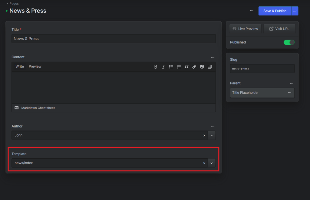
</header>The last thing was to tell Statamic which template to use for the “News & Press” page, for that you go the the Pages and select the news page and at the bottom you can select the template (its the folder directory from the views folder).
News Card
Index
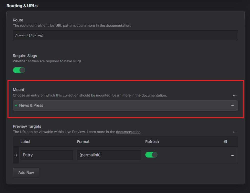
The first course of action is to create a new collection for the news articles. Now Statamic has a cool way on how you can link the entries of one collection to a page of another entry. So I scrolled all the way down to the “Routing & URLs” section and under Mount select the desired entry which is “News & Press”.
Now what this does, is that now the entries of this collection will be subpages of the selected entry which allows that we can now create & add or edit entries of the “News Articles” collection right at the “News & Press” entry. Meaning that you don’t have to navigate around Statamic as much.
Now we create a blueprint for the newly created collection with the desired field for the news articles. Those are:
A title as a text field, an author as a users field, the featured image as an image and the article text as a bard field.
The bard field work a bit similar to the markdown field but it has more customisation capabilities allowing you to add custom block (quotes, galleries, etc.) or other things you desire its also better if you wish to add images between the text or so. That’s why for the news articles i opted for the bard field. Another thing that i enabled in the bard field is the estimated read time. So one can have a general idea on how long the article takes to read.
Now that the blueprint is set I can go back to the “News Articles” collection and add the entries. I for now just created 3 which is row (since i put a limited in the code for a max of 3 per column).
Now that all those things are done I can return back to the code into the “_card.antlers.html” file and link it to Statamic with the antler tags.
- a tag, href link -> {{ url }}
- image src -> {{ featured_image }}
- title text -> {{ title }}
- publish date -> {{ date }}
- author name -> {{ author:name }}
<div class="rounded-xl h-[500px] block bg-gray-200 group flex flex-col hover:scale-105 transition duration-[400ms] ease-in-out">
<a href="{{ url }}" class="relative overflow-hidden rounded-t-xl">
<img class="object-cover transition duration-[400ms] ease-in-out scale-110 group-hover:scale-100 w-full h-60" src="{{ glide :src="featured_image" width="600" height="400" fit="crop_focal" }}" alt="">
<div class="absolute opacity-0 transition duration-[400ms] ease-in-out group-hover:opacity-75 z-20 inset-0 mix-blend-overlay object-cover w-full h-60 bg-gradient-to-br from-orange-dark to-aqua"></div>
</a>
<div class="px-6 py-8 flex flex-col justify-between flex-1">
<h3 class="font-bold text-2xl text-white">
<a href="{{ url }}" class="transition hover:text-yellow">{{ title }}</a>
</h3>
<div class="flex items-end justify-between">
<div>
<p>{{ date }}</p>
<p class="text-sm">By <a href="" class="text-gray-700 hover:text-white">{{ author:name }}</a></p>
</div>
<a href="#" class="px-3 py-1 text-gray-100 font-bold bg-yellow transition hover:bg-orange rounded-full text-sm">technology tag</a>
</div>
</div>
</div>Now the last step for this part is going back to the “index.antlers.html” and adding a loop so it shows a card for each news article. For that I add the
“{{ collection:news }}” and “{{ /collection:news }}” antlers tag so it loops over the card displaying one for each entry in the news collection.
<section class="grid grid-cols-1 sm:grid-cols-2 lg:grid-cols-3 max-w-6xl mx-auto gap-x-8 gap-y-16 px-4">
{{ collection:news }}
{{ partial:news/card}}
{{ /collection:news }}
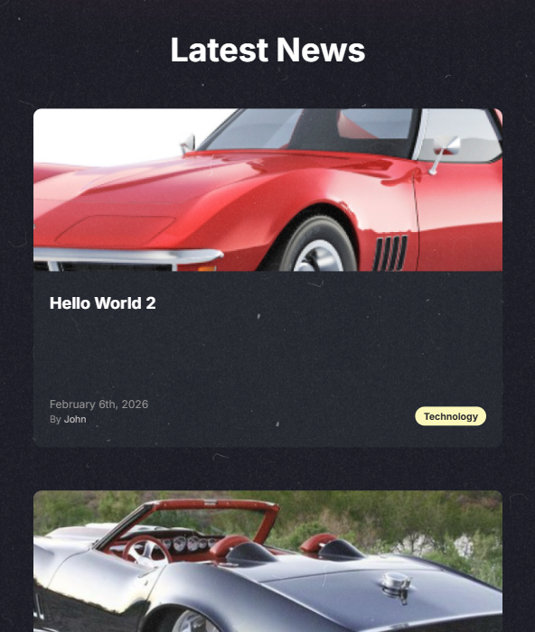
</section>Now as a addition to the homepage I added at the bottom a part where the most recent news articles get displayed. This was done basically the same as in the “News & Press” page besides that I added a limit to how many articles are shown.
<section class="max-w-5xl mx-auto px-4 lg:px-6 py-40 relative hero">
    <h6 class="text-red font-bold text-lg antialiased mb-4">{{ teaser }}</h6>
    <h1 class="text-6xl md:text-7xl lg:text-8xl tracking-tight text-white font-bold">{{ title }}</h1>
    {{ if show_lightning_bolts }}
    <img src="/img/lightning-bolts.png" class="absolute h-64 top-8 right-0" alt="Lightning Bolts">
    {{ /if }}
    <div class="max-w-4xl mt-12 hero-subtitle">
        {{ subtitle }}
    </div>
</section>

{{ partial:panels }}
<section class="max-w-6xl mx-auto px-4">
<header class="my-12 md:my-16 lg:my-24 text-center">
<h2 class="text-4xl md:text-5xl lg:text-6xl text-white font-bold">Latest News</h2>
</header>
<div class="grid grid-cols-1 sm:grid-cols-2 lg:grid-cols-3 gap-x-8 gap-y-16">
{{ collection:news limit="3" }}
{{ partial:news/card }}
{{ /collection:news }}
</div>
</section>Tags
Now the card is almost done the only thing remaining is the tag/s. For that I go back to Statamic and create a Taxonomy called “Tags” after which we create a blueprint for it and add a title as a text field, a content as a markdown field, an author as a users field and a template as a template field.
After which I created two Tags “Team” and “Technology”.
Then I went back to the blueprint for the “News Articles” collection and in the sidebar added Tags as a terms field (so we can select tags when we create / edit news articles.) and selected the “Tags” Taxonomy under Appearance & Behavior where it asks from which taxonomy it should get the terms from. Now i went back to the news articles and edited the entries and added a tag each via the sidebar.
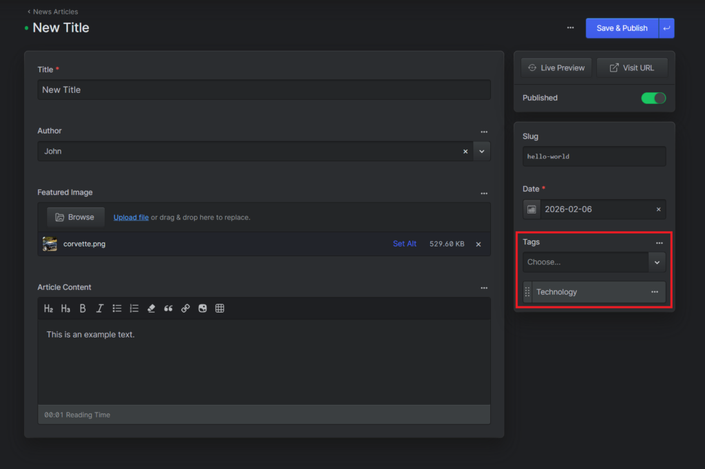
Now the last step for this is to connect my static tag to Statamic so it will be responsive. So in my “_card.antlers.html” file for the tag i added the
“{{ tags limit=”1″ }}” and “{{ /tags }}” and replaced the href with “{{ url }}” and the tag name with “{{ title }}”.
<div class="flex items-end justify-between">
            <div>
                <p>{{ date }}</p>
                <p class="text-sm">By <a href="" class="text-gray-700 hover:text-white">{{ author:name }}</a></p>
            </div>

            {{ tags limit="1" }}
            <a href="{{ url }}" class="px-3 py-1 text-gray-100 font-bold bg-yellow transition hover:bg-orange rounded-full text-sm">{{ title }}</a>
            {{ /tags }}
</div>Show
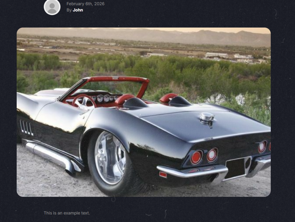
The last step is to create the single article view. Since before for the “News & Press” page everything required is already created. So basically all that’s left is to in infuse the statamic into the existing code. So same as before besides now i also added the article content and the author avatar. I adjusted / added the following:
- static tag/s -> {{ tags }} & {{ /tags }}
- a tag, href link -> {{ url }}
- title text -> {{ title }}
- image src (author) -> {{ author:avatar }}
- publish date -> {{ date }}
- author name -> {{ author:name }}
- image src (article image) -> {{ featured_image }}
- article text -> {{ article_content }}
<article class="max-w-5xl mx-auto px-4 lg:px-6 py-24 relative">
    <header class="max-w-3xl mx-auto">
        {{ tags }}
        <a href="{{ url }}" class="px-3 py-1 text-gray-100 font-bold bg-yellow transition hover:bg-orange rounded-full inline-block mb-8">{{ title }}</a>
        {{ /tags }}
        <h1 class="text-5xl md:text-6xl lg:text-7xl tracking-tight text-white font-bold">{{ title }}</h1>
        <div class="flex items-center mt-12">
            <img class="rounded-full h-16 w-16" src="{{ author:avatar }}" alt="{{ author:avatar:alt }}">
            <div class="ml-6">
                <div>{{ date }}</div>
                <div>By <a href="" class="font-bold text-white">{{ author:name }}</a></div>
            </div>
        </div>
    </header>

    <figure class="mt-12">
        <img src="{{ glide:featured_image width="1800" height="1200" }}" alt="{{ featured_image:alt }}">
    </figure>

    <section class="max-w-3xl mx-auto mt-12 content article">
        {{ article_content }}
    </section>
</article>Mobile View
A good website is compatible for all different types of devices even the special ones like the Samsung Z Fold 5 or other smaller / thinner phones or even just a tablet and also ultrawide monitors. But a good starting point is the “normal” view so the one on a laptop or normal monitor and then a mobile view, so the one for phones. Though over the years with the invention of phones which kept getting more advanced the “normal” view became more and more the mobile view which is why generally you build that one first. Its also the one you generally wish to optimize first since it tends to be more complicated. In my case i went for the most common 3: the phones (small), the tablets(medium / medium-large)
and the desktop (large) views.
Navigation
As mentioned before in the main nav section that while i already implemented a mobile version for the navigation I didn’t yet fuse it with Statamic so that its dynamic. That’s what i did now. The way to do it is almost identical to the main navigation besides the fact here you add the home link separately because that is not included when you call the pages.
<div class="p-2 border-t w-full bg-gray-100 min-h-screen absolute z-30" x-show="mobileNavOpen" x-cloak x-trap.noscroll="mobileNavOpen">
        <ul class="flex flex-col text-white">
            <li><a href="/" class="py-2 px-4 block font-bold">Home</a></li>
            {{ nav:collection:pages }}
            <li><a href="{{ url }}" class="py-2 px-4 block font-bold">{{ title }}</a></li>
            {{ /nav:collection:pages }}
        </ul>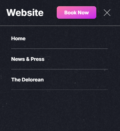
</div>While this works also for medium screens (tablets) it looks weird in a sense because there is a ton of empty space on the right side. I knew that there was a certain way websites tend to make the navigation for medium screens. That is that it uses only a percentage of the screen instead of the full width. Now i didn’t fully remember what the general scale is or how its constructed in general so i quickly went to look it up. My first stop was the hosttech page which did have one for medium screen in the same manner i had in mind. So now with a example i did it for my own website.
For that i needed to limit the width of the nav (for medium screens) which i opted for 2/3 because it looked good. And then the base code made it appear from the left so i had to change that as well. The second step was to add another layer so the main page (in the background when the nav is open) to loose focus. That is usually done by darkening it. I just created a div with a black background and 50% transparency and only make it appear when the nav is open. I used this because its the way i’ve done so in the past and its also the only way i know how.
<div class="fixed inset-x-0 bottom-0 md:top-21 bg-black/50 z-20" x-show="mobileNavOpen" @click="mobileNavOpen = false" x-cloak></div>

<div class="p-2 border-t w-full bg-gray-100 min-h-screen absolute z-30 md:w-2/3 right-0" x-show="mobileNavOpen" x-cloak x-trap.noscroll="mobileNavOpen">Before:
After:
Yet another change i made is making the text size for the small & medium-large screens (phones & tablets) and add dividers to make the navigation links easier to press and make it visible where each element starts / ends. I did this for accessibility purposes so people with shaky or big hands have an easier time navigating the page.
Small screens (phones):
Medium-Large screens (tablets):
Another thing i did is for small screens make the text size and padding on the x-axis a bit smaller so the text doesn’t warp and stay on one line.
Main Page
Title
The next part was the title, the current problem is that if the screen gets smaller that the image collides and overlaps with the title itself. So to fix that and to make it easier / better for smaller screen i opted for removing the image on the smaller screen. This is so that its less cluttered.
Tailwind CSS work with a mobile first system. Meaning that the base build will be for mobile and if you wish to change things you do that after. This is because Tailwind has a way to display something after a certain breakpoint. So when a screen has a certain view size which is above the defined breakpoint then it will add the given styles. Tailwind CSS Breakpoints
{{ if show_lightning_bolts }}
    <img src="/img/lightning-bolts.png" class="hidden lg:block absolute h-64 top-8 right-0" alt="Lightning Bolts">
{{ /if }}The second part of adjusting the Title was to move the title more inwards so its more centered and the right side doesn’t look as empty. For that i added extra margin on the left & right side. But i just did that for an medium screens (ipads / tablets) because if it would also have that margin on the small screens (phones) then its too compressed which makes it look weird. For that i added mx-auto (for small screens), sm:mx-12 for medium screens and lg:mx-auto again for large screens.
<section class="max-w-5xl mx-auto sm:mx-12 lg:mx-auto px-4 lg:px-6 py-20 lg:py-40 relative hero">Output:
Panels
The biggest existing issue (besides the image collision with the title) are the panels. That is because there are 2 per column which leads to them being crammed and the text “glitching” out of the box. Now the fix for that was to make it only be one box per column. This makes them appear below one another instead of besides making it look nicer without any “glitches”. Another thing i did to make it look nicer is reduce the distance between the elements.
<section class="max-w-6xl mx-auto sm:mx-12 lg:mx-auto p-4 lg:px-6 grid grid-cols-1 lg:grid-cols-2 gap-8 pb-12 {{ ! first ?= 'mt-12 lg:mt-32' }}">The second part was to reduce the height of the panels. Because currently you had to scroll a bit to view them and it just looked too big for the screen.
So i just reduced the height.
<div class="rounded-xl h-[350px] lg:h-[500px] block bg-black/[.8] shadow-glow-red p-8 flex items-center">Now the last step is the same as with the title, to add some space on the x-axis to make it look nicer. Here also again with a set margin for middle sized screens.
<section class="max-w-6xl mx-auto sm:mx-12 lg:mx-auto p-4 lg:px-6 grid grid-cols-1 lg:grid-cols-2 gap-8 pb-12 {{ ! first ?= 'mt-12 lg:mt-32' }}">Small Screens (button is fixed):
Middle Screens:
News Cards
For the news cards it was a very similar issue as the panels, that being the fact of the amount of cards per column and the space on the x-axis.
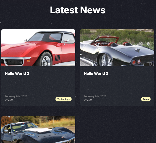
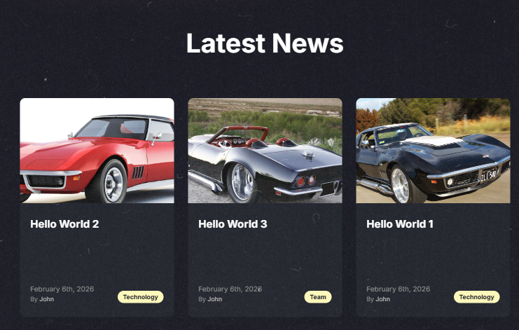
In this case the columns differ in the scaling, meaning that it switches from 1 per column for small screens, 2 per column for medium-large screens (tablets, big ones) and 3 for extra large screens (so desktops for example).
The spacing on the sides is the exact same as the panels or even the title, i did this so it has an even spacing so it looks nice and not misarranged.
<div class="grid grid-cols-1 lg:grid-cols-2 xl:grid-cols-3 gap-x-8 gap-y-16 mx-auto sm:mx-12 lg:mx-auto">Small & Middle Screens:
Middle-Large Screens (big tablets):
Large Screens:
Now another thing i did is on the single news post view is make the picture have rounded corners. The other images are rounded as well so i opted to chance them to be rounded to make it look more uniform which is generally nicer on the eyes.
Output:
Features
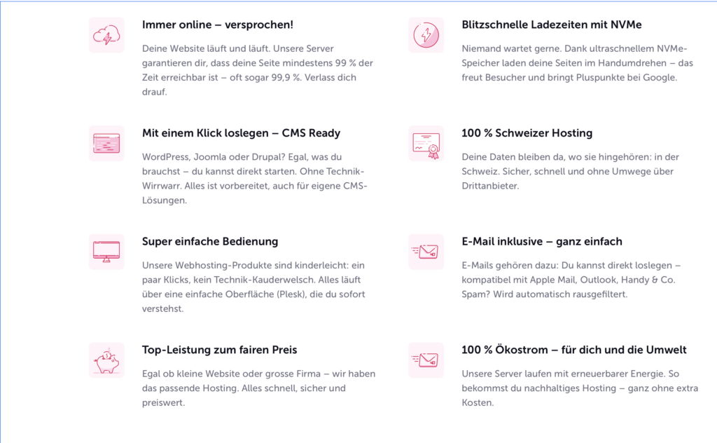
This was an extension task for my existing Statamic project. The goal is to recreate this “Features” part which exists on the hosttech page with Statamic. A added feature to these “Features” was that you should be able to select how many columns they should have: 1, 2 or 3.
Now for me the first step was some research. Since i know i would want this to be a part which can be taken and “injected” anywhere desired. Now while i knew that in code it would be a partial (for me at least since) because it’s similar to the panels. The only problem was that i didn’t know which Statamic element would fit best for this. Now after said research was concluded the i reached the verdict that a “Global Set” would fit nicely.
For reference to what a global set is:
A Global Set in Statamic is a centralized container for site-wide content like contact details, branding, or footer text.
You define fields and values once in the control panel, then access them anywhere in your templates, ensuring consistency and easier updates.
This helps keep your content organized and avoids repeating the same data across multiple pages.
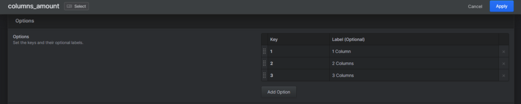
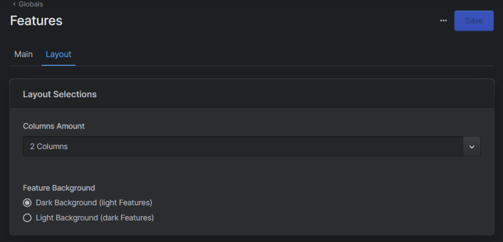
Now that i know how im going to create the features i need to actually do it. So for that i created a Global Set called “Features” and then a blueprint for it. Then i created a second tab called Layout with a selector field called “columns_amount” with the 3 values: 1 Column, 2 Columns and 3 Columns, so you can easily select how many you want.
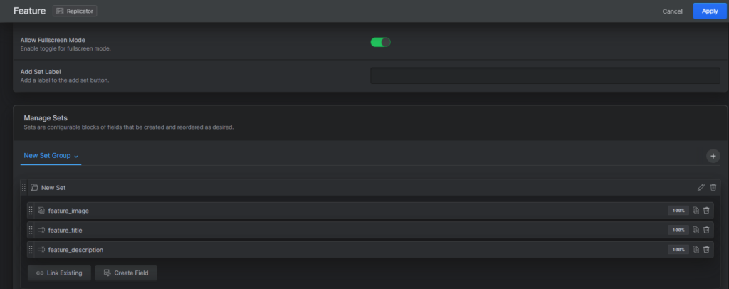
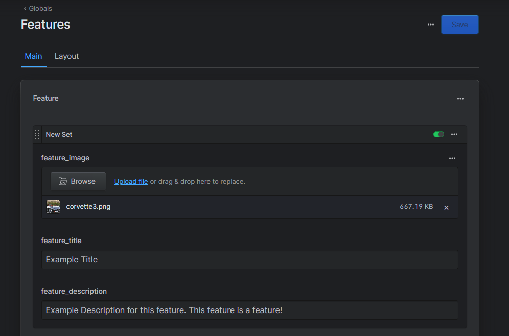
After that i went back to the main tab and created a replicator field called “Feature”. The reason i choose a replicator field is because for like nested elements like this, where you have different parts (texts & image) in a box and i also used the same one for the panels. Now For the replicator field i added the three elements a Feature has: an image (an asset), a title (a text field) and a description (also a text field).
Now with the blueprint completed i could now create the actual “Features” that will be displayed.
Now with everything done in the Statamic control panel its time to program it so we can actually display it.
For that created a new file called “features.antlers.html” inside partials folder.
Then inside there i added all the necessary html & css code so it will be displayed. The details aren’t important at this time since I just want to be able to see if it actually works and how it looks. The fine tuning comes a bit later.
Now after that we need to add this code to our desired location where we wish to display the Features (once again exactly the same as with the panels just a different name of course):
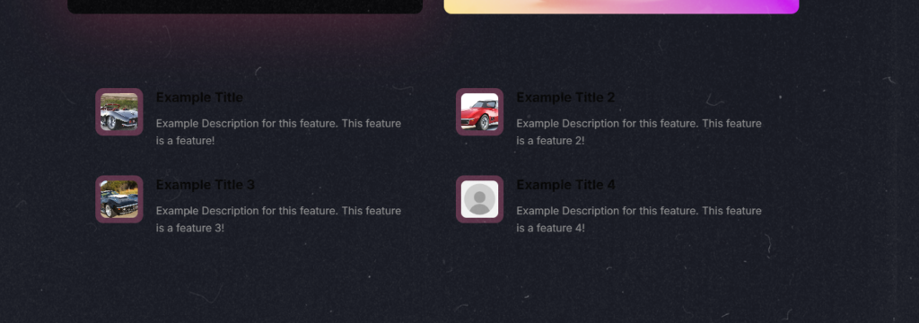
{{ partial:features }}Now if everything was named correctly and all it should display the features on the main page (since i added this code there). Now for me this didn’t immediately work and after a bit of trial and error i decided to ask Manuel for assistance since he’s familiar with Statamic. Then after some trial & error with him we were able to make it work.
Now that i can actually see what im doing i can dedicate myself to the details and get the fine tuning done. Since im recreating something its generally just a bit of guessing and trial & error to figure out the distances, sizes and colors for these but after a bit i got it done.
Now i had to make sure that it was all compatible with different screen sizes. While it mostly was since i made sure from the beginning that it would be some details i had to add. For example some spacing on the x-axis so its not sitting at the edge of the screen.
During that i also constantly checked with the different screens & columns amounts to see if it looked nice and after a bit i was happy and finished.
Now after review of what i did with the features i got a few extensions / adjustments i should / need to make.
The first one was to adjust the feature description field from a normal text field to a text-area field. That was since the descriptions tend to be on the longer side, they won’t usually fit on a “1-Liner” so the text area makes it easier & nicer to grasp the overview of the description. The change was really simple in Statamic just delete the old text field and add the text area field with the same name & slug.
The second part was to change the way i handled the columns amount selecting. Before i had the if statements directly in the class but now i changed it so each column amount (1, 2 & 3) has its own div. Like so:
// Before
<div class="mx-auto grid max-w-5xl grid-cols-1 gap-y-10 md:gap-x-16 justify-items-center {{ if columns_amount == '2' }} md:grid-cols-2 {{ /if }} {{ if columns_amount == '3' }} md:grid-cols-2 lg:grid-cols-3 {{ /if }}">

// After
{{ if columns_amount == '1' }}
    <div class="mx-auto grid max-w-5xl grid-cols-1 gap-y-10 md:gap-x-16 justify-items-center">
{{ elseif columns_amount == '2' }}
    <div class="mx-auto grid max-w-5xl grid-cols-1 md:grid-cols-2 gap-y-10 md:gap-x-16 justify-items-center">
{{ elseif columns_amount == '3' }}
    <div class="mx-auto grid max-w-5xl grid-cols-1 md:grid-cols-2 lg:grid-cols-3 gap-y-10 md:gap-x-16 justify-items-center">
{{ /if }}Now while yes it is more lines of code its more practical. More specifically it enhances the readability of the code, meaning that it’s easier to see and grasp what this code does. So while you could argue that since it’s more lines and also some duplicated its worse but in this instance i’d wager that the readability of the code is worth more (and for this task it was required).
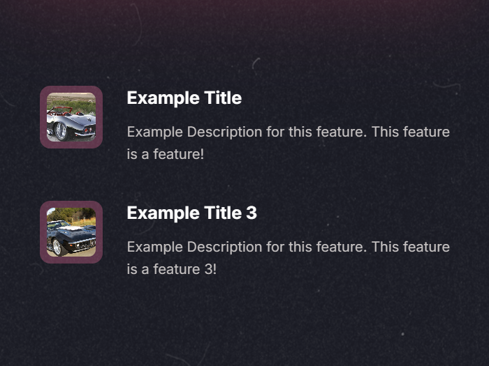
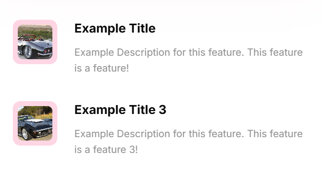
Then the last part was to make it so you can select dark / light mode for the Features so if you have a dark background its still nicely visible. For that in the Layout tab in Statamic i added a Radio field below the column amount selection where you can choose either dark or light mode. I set the dark mode as a default value since my page has a dark background.
Then in the code i created a variable “isDarkmode” and checked the value given from the “Feature Background” radio field if it’s value is dark. Like so:
{{ isDarkmode = (feature_background == 'dark') }}After that i went to the affected parts of the code, which were the title and description. There i added a check to see if the variable “isDarkmode” is true and if so to make the text bright and if not then make the text dark. The same with the description. Like so:
<h3 class="mb-3 text-xl font-bold {{ isDarkmode ? 'text-white' : 'text-black' }}">{{ feature_title }}</h3>
<p class="text-md leading-relaxed {{ isDarkmode ? 'text-gray-800' : 'text-gray' }}">{{ feature_description }}</p>I opted for a variable solution because its simple and you can just reuse it where ever you wish really. Though in this case this only works inside the “Features” global set since the value is set there and is therefor confined in there. Now yes you could make a call to the inside of the “Features” global set to access the value given there it’s highly discouraged to make something like that. If you wish to have a global dark / light mode then you should make a new global set for example.
Dark Mode / Background:
Light Mode / Background:
Support Card
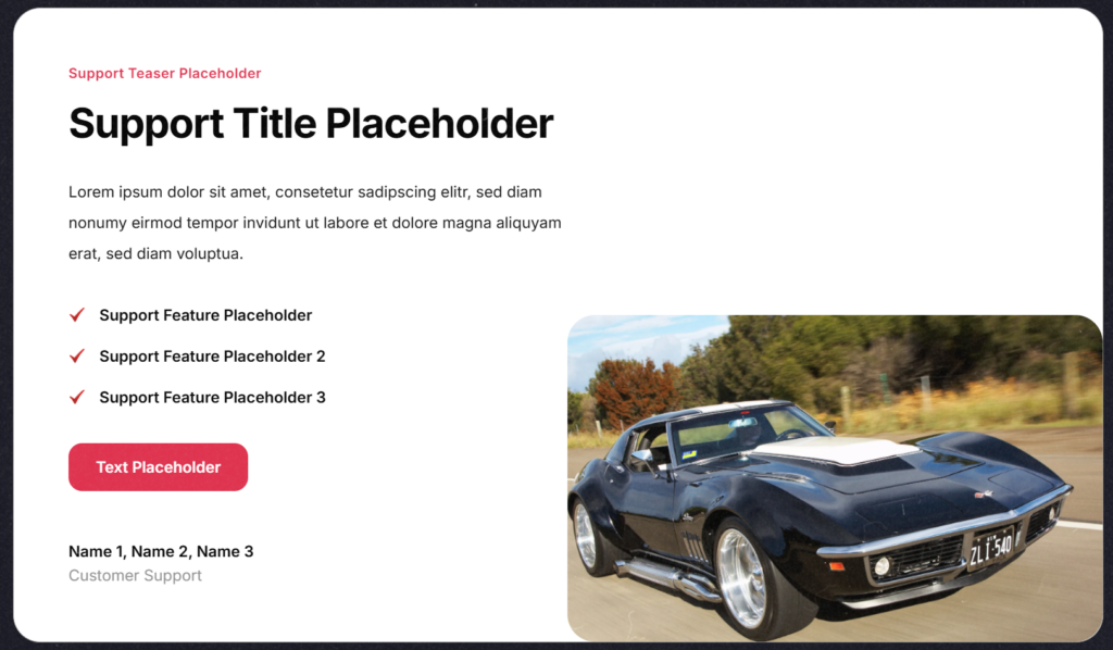
A new addition is a “support card”, it’s a card with some base information & a picture of the support team. I got a reference image which i should recreate.

The first step was to decide what it should be, after which i decided that a global would fit because it has quite similar use cases to the features which is a global. So i created a new global set and named it “Support Card” and then i added the fields which i required: some text fields, an image, and a button. Like so:
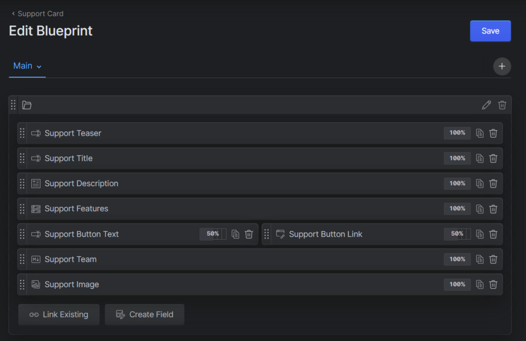
Now that the blueprint was done i added some filler for the content of the support card, so it would actually have something to display.
Then i moved over to the code editor, for that i created a new file in the partials folder called “support_card.antlers.html” and directly added it to the “home.antlers.html” file so it will be displayed once i make any changes.
{{ partial:support_card }}After that i coded the support card itself on how it should be displayed. This takes a short moment but over time the whole thing with tailwind css and the mobile first stuff comes easier which is nice. Sometimes i had to look up how exactly a tailwind class is named or how to do something. For example i learned that you can make / use negative margins which i actually used here to make sure the image is at the very bottom-right. This is the final result:
Contact Card (Support)
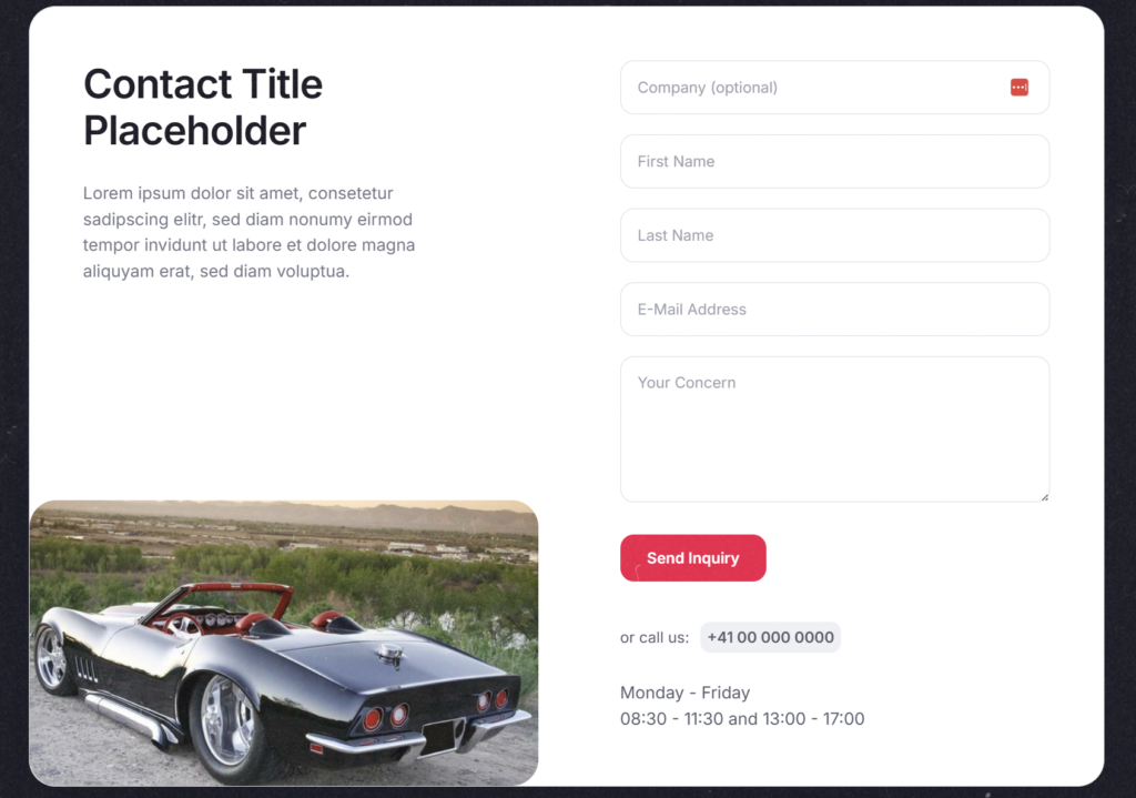
A second new addition is similar to what i did just before with the “Support Card” since the base is the same but this has now a form which you can contact the support with.
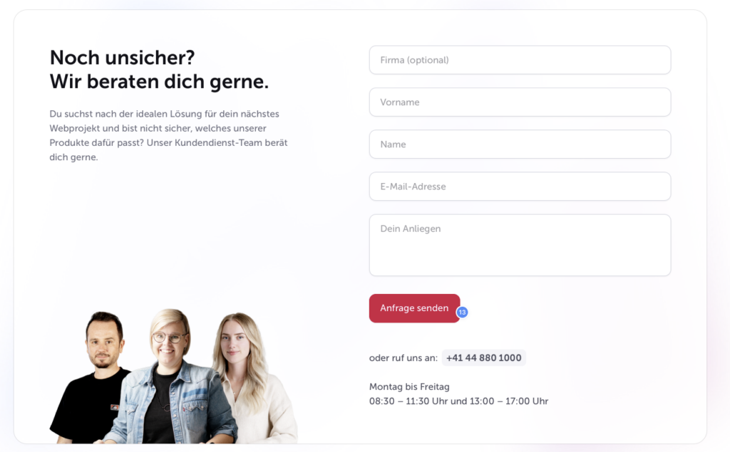
Now the first thing i did same as with the Support card is create a new global for the contact card. For that i took the different parts, the title, description, the image, the contact button (which will submit the form) then the contact number and lastly the contact times. I went for a text field for the contact times because on the reference image i got the text is multiple lines. So when (in Statamic) you add the text and you format it how you want it then I or well one can make it so it displayed exactly like that with the line amount.
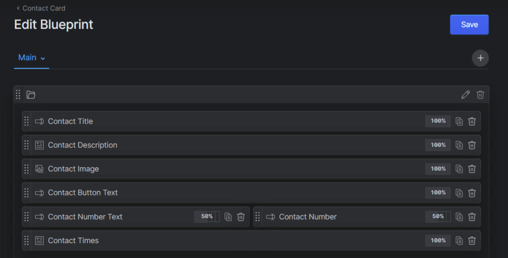
Now one might notice that the fields required for a form are missing, that is because Statamic has “Forms” feature which you can control and even generate those. So the next step was to create a Form for this contact card. Now here i added the desired form fields. The company as an optional text field, the first name as a required text field same as the last name, the email as an email text field and finally the concern as a required text field.
In Statamic you can enter which fields are required and which aren’t under the validation tab. I opted for these required fields because from the reference image it looks like the company is the only optional one and just as a general understanding it wouldn’t make sense the have the name (full name), the email or the concern missing. Now while you could perhaps make the first name maybe even instead the last name optional but to my knowledge that isn’t common practice at least if both fields exist. I would rather then just remove the first / last name field completely.
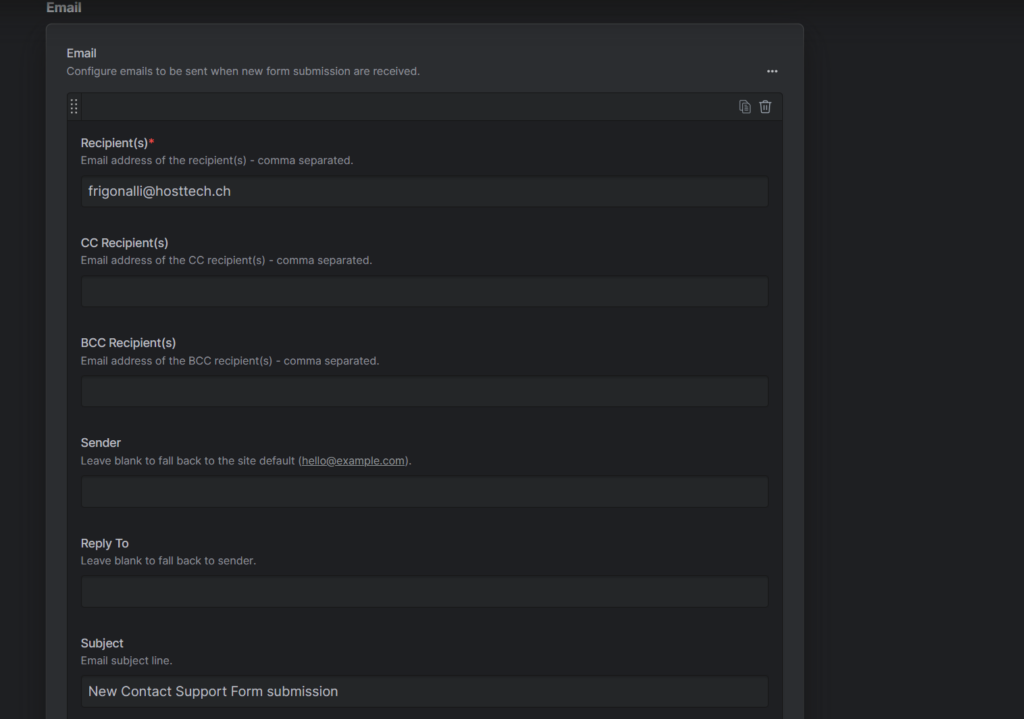
The last step is that since it is wished that I receive an email whenever someone submits this form (so you can see and respond in a timely manner) was to edit the form itself. There is an email section under which you can enter who should receive the email from whom the email should be sent the subject, the attachments, etc. so just all those settings. In my case i entered my email address and a fitting subject.
Now that were done with the Statamic site part we can head to the code editor. I firstly created a new file inside the partials folder called “contact_card.antlers.html” and programmed the necessary code. Something special with the Statamic Forms (which you call with “{{ form:contact }}”) is that it has inbuilt features for error & success handling so you can easily provide user feedback based on the result. For that you can just make an if check for errors or success and then display the errors or any given success message and display them as wished. Here’s how i did it for example:
{{ if success }}
    <div class="rounded-2xl border border-green-200 bg-green-50 px-5 py-4 text-sm text-green-800">
        Thank you — your message has been sent successfully.
    </div>
{{ /if }}

{{ if errors }}
    <div class="rounded-2xl border border-red-200 bg-red-50 px-5 py-4 text-sm text-red-dark">
        <ul class="space-y-1">
            {{ errors }}
            <li>{{ value }}</li>
            {{ /errors }}
        </ul>
    </div>
{{ /if }}Now another thing that i did (which was also something i had to do) is see that i can extract something into its own partial so it can be reused. Meaning that i don’t have to write duplicate code. Now after looking it over i decided on the button which has been used for both cards (support & contact card). Since they were almost identical. For that i created a new folder inside the partials folder called “components” and inside there a new file called “support_button.antlers.html”. Then i added the code for the button. Now i needed to add something new because in the support card the button is a link and in the contact card its a form submit button. So for that i added if checks along with parameters you can fill so you can display either depending on which you require. Like so:
---
as: button
type: button
text: Button
---

{{ button_classes = "inline-flex items-center justify-center rounded-2xl bg-[#e11d48] px-8 py-3.5 text-lg font-semibold text-white transition hover:brightness-90" }}

{{ if as == "link" && url }}
<a
    href="{{ url }}"
    class="{{ button_classes }}"
    {{ if target }}target="{{ target }}"{{ /if }}
{{ if rel }}rel="{{ rel }}"{{ /if }}
>
{{ text }}
</a>
{{ else }}
<button
    type="{{ type }}"
    class="{{ button_classes }} cursor-pointer"
    {{ if name }}name="{{ name }}"{{ /if }}
{{ if value }}value="{{ value }}"{{ /if }}
>
{{ text }}
</button>
{{ /if }}
---
as: button
type: button
text: Button
---These are said parameters, they function as an API so you can give a value for them and depending on the value it will then display what is “assigned” that value. Now all that was left is inject the button component back into our contact card, like so:
<div class="pt-2">
    {{ partial:components/support_button
    text={ contact_button_text }
    as="button"
    type="submit"
    }}
</div>The second part that i extracted into its own components is the form itself. That is because chances are that one will have more that 1 form field in a website. For that i created new filed in the recently created components folder called “contact_from.antlers.html” and added my code for the form fields. After which i also had to add it back to the contact card, like so:
{{ partial:components/contact_form }}Final result:
Stars (Rating) Component
The next addition is a Stars Rating Component, the goal is to recreate it as given in the following image with the options to choose the stars amount and the amount of reference links which automatically adjust the text if you have a different amount so with 1 reference link: Bei xxx, with 2 Bei xxx und xxx and for each more for the to be separated by a “,” besides the last one of course.

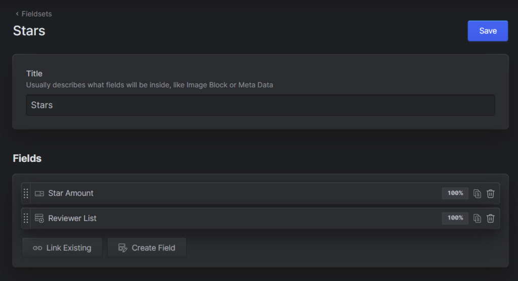
As always i firstly did what i needed in Statamic. I first thought about making it a global since its also a component as the what i created before with the cards but since the stars review is more so used in conjunction with something i opted for a Fieldset since they are here to be incorporated into other blueprints. So i created a new Fieldset and named it “Stars” and then i created a “select field” for the stars amount, i was torn between a slider and a selector but the decision fell to the selector because you can’t make the slider in .5 increments which eliminated it as a valid option. And then a “Grid” for the reviewer / reference list in which i added 2 simple text fields, 1 for the name you wish to have displayed and 1 for the link for the reviewer. I choose a grid since it makes it easy to add multiple items of which in this case are the reviewers.
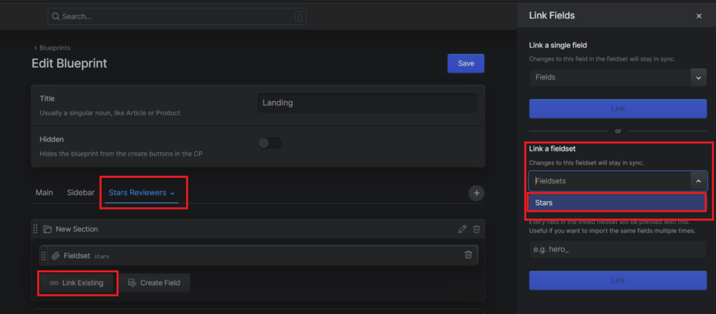
After that i had to incorporate it into another blueprint for which i choose the landing page since i displayed my previous works there as well.
So i headed to the blueprint for the landing page and added a new tab, named it stars reviewers and “imported” the stars fieldset i created, like so:
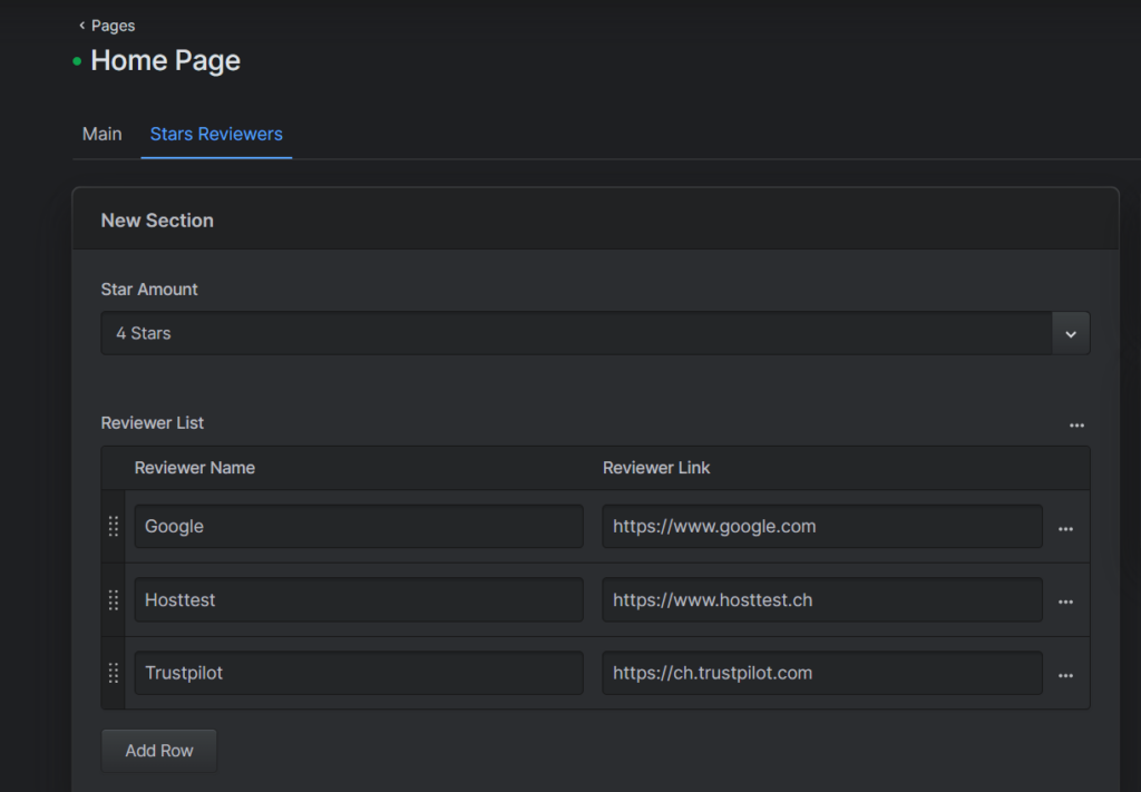
Now i could head to the landing page itself and create some filler so it will actually display something once i add the code.
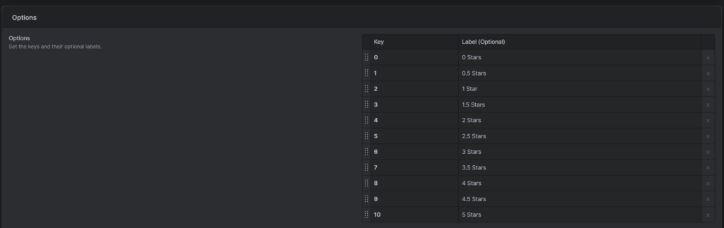
Now for the select field i had (wanted) to adjust something and that is the options and their values i firstly did the following:
– value: 0 -> star amount: 0
– value: 0.5 -> star amount: 0.5
– value 1 -> star amount: 1
But then when you actually selected the fields (in the landing page) the order would be messed up since the decimal values would all be bunched up so i adjusted the values to full numbers like so:
– value: 0 -> star amount: 0
– value 1 -> star amount: 0.5
– value 2 -> star amount: 1
Because like this the order is nicely arranged, going from 0 to 5 stars and not mixed.
Now with everything done in the Statamic part i headed to the code. There i created a new file inside the components folder insides the patials folder named “start_review.antlers.html”. I added it inside the components folder since it seemed to small to be a “full” partial and since its used in conjunction with something else it seemed a better fit.
Here there were two main hurdles the first one being the logic behind the stars so they are displayed correctly via the amount selected and the other hurdle is that the reviewers are correctly separated & displayed.
For the first hurdle i did some research on the best way on how to go about doing that, googled, asked AI also to see if what i got from other sources is the same as what AI would recommend which it was though AI was able to give a more detailed breakdown of the matter in a shorter span of time.
In the end i went with mathematical logic to see if the value is odd or even to define whether a full or a half star should be displayed and then the “basic” star which are always there inside a loop so it repeats that 5 times (for 5 stars). I tried getting the svg from the hosttech website since thats where the original image for the task came from but it didn’t seem to want to work so i asked ai to give me a suitable svg for the stars which is the one i used.
{{ loop from="1" to="5" }}
{{ if star_amount.value >= (value * 2) }}
{{# full star #}}
  // code for displaying full star
{{ elseif star_amount.value == ((value * 2) - 1) }}
{{# half star #}}
  // code for displaying half star
{{ else }}
{{# empty star #}}
  // code for displaying empty star
{{ /if }}
{{ /loop }}The second hurdle was a bit simpler since “all” that was required was an if check. Well it was a bit more complicated than that but that’s the gist of it.
So i added a check that if it isn’t the first element and if its the last element that it should display an “und” otherwise an “,” like so:
<p class="text-sm text-gray-900 font-semibold">Bei {{ reviewer_list }}{{ if !first }}{{ if last }} und {{ else }}, {{ /if }}{{ /if }}<a href="{{ reviewer_link }}" class="underline hover:no-underline" target="_blank">{{ reviewer_name }}</a>{{ /reviewer_list }}</p>Final Result: